Designing Data – Part 4: Design and Prototype
We’re asked about our design all the time – usually in an incredibly kind way full of high fives and “how’d you do that?!”s but sometimes in a “ugh, did you even think about talking to a customer??” kind of way. So, we decided to give you a week-long deep dive into our design process in this “Designing Data” series. Yesterday we looked at the data, and today we’re talking about designing against it.
Once we know that we’re solving real problems and using good data, we get to the part that everyone sees, touches, and (hopefully!) falls in love with: The design.
While we love delighting users and get pretty jazzed when people ohh or ahh over what they see on screen, we make sure to have a few people on our product design team who are solely responsible for making sure that the design uses and highlights the data we’re displaying in the best possible way. So that it’s not just pretty, but usable.
Although this is the stage where pixels are pushed, lines of code are also written. Usually, we need to prototype a live design to make sure we can touch it, vet it, and sometimes get user feedback on it, regardless of how rough it is.
Whether it’s quickly building a navigation system to make sure it functions instinctively or prototyping a visualization with real data pumping through it to see what it looks like — a functioning, built design lets you see things that you never would in the static world of Photoshop.
For this very reason, every designer on our team is also a developer.
When pulling together the original Chartbeat dashboard Overview, we went through a bunch of prototypes that were pushed out to small groups of our users.
Well, they didn’t love everything, that’s for sure. That sucked. We’d spent hours/days/weeks designing and prototyping….and it just didn’t work. But we don’t try to make it fit or fall on our sword and go with it anyway. We made that first version of the Overview better.
From the beginning, our goal for this view was to provide a high level, at-a-glance view of the site so it was obvious if something interesting or unusual was happening.
Some of our early concepts were knocked down by users mainly because we weren’t answering the questions they were asking, the needs they had at that instant level.
Honestly, many of these concepts were visually much more appealing than the design we launched with but, as always, the goal isn’t only to make things pretty; the goal is finding the delicate balance between beauty, usefulness, and delight. To us, that’s the core of good design. That’s is what makes people who don’t have time for raw data able to understand, use, act on, and enjoy our products.
So what were those pretty (but not so useful) designs that didn’t make it for Traffic Sources?
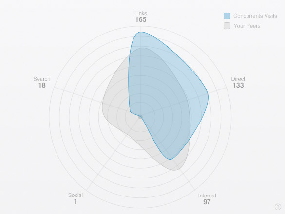
The radar chart is a beautiful visualization and has the advantage of being able to quickly compare shapes, but it falls apart in the eyes of many users who are trying to get precise values of individual traffic sources.
A radar chart is intended to show balance, when in reality most sites don’t have (and shouldn’t have) an equally balanced set of traffic.
So we canned that guy and moved on to the dot chart.
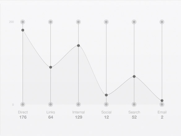
The dot chart was definitely cool, but it didn’t work for us a different reason. We liked the idea of being able to show a shape, or thumbprint, of your site’s traffic and added a connecting line between the values. The line didn’t have a value – it was just meant to aid the eye in spotting the dots easily.
But users were interpreting it is a relationship between each traffic source, which it certainly wasn’t meant to be. We took a hit on that one for sure. The last thing we ever ever want is to launch a misleading visualization!
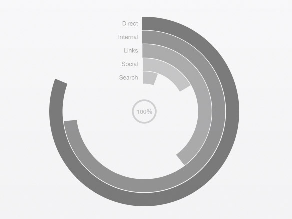
Then came the circle chart. This guy had a lot of promise. Circle charts can be beautiful and usable, but its main weakness really shows when trying to compare values on different radii. The eye gets a little tripped up. Not to mention that it’s tricky to grasp at a quick glance – the whole point of the Overview. So we inevitably trashed this guy, too.
How did we land on our “final” design? Check back tomorrow to read our last piece of Designing Data: Launch and iterate.