Designing Data – Part 5: Launch and Iterate
We’re asked about our design all the time – usually in an incredibly kind way full of high fives and “how’d you do that?!”s but sometimes in a “ugh, did you even think about talking to a customer??” kind of way. So, we decided to give you a week-long deep dive into our design process in this “Designing Data” series. Today’s the last post in this series…though iterating never ends, so maybe there will be more down the line. Stay tuned!
We make changes constantly. Seriously. Every day.
Sometimes they’re small and only our most dedicated users notice them; sometimes they entirely change the way people interact with our data. We don’t look at these changes as regressions, dead ends, or a waste of time; we look at this as the right way to design products.
We vet everything intensely, but we can only do so much in the confines of our office with a few dozen users in pre-launch testing. And the only way to know if we’ve succeeded is to put it all out there into the real world (even if it sometimes results in a few harsh Tweets headed our way).
So, when a new design is launched, we can’t just pick up and move onto the next thing. We listen. We read every email coming into customer service, we consider every tweet, we grab everyone who wants to talk to us about what we’ve done and we listen. We figure out where things rocked and where things sucked and then this whole cycle starts again.
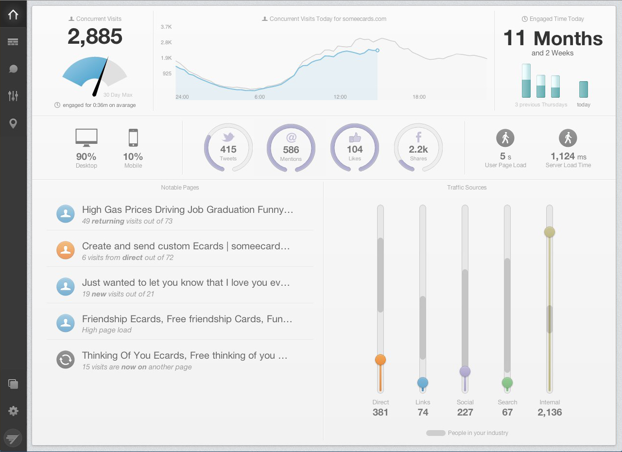
If you’ve been following this design blog series, you know that in our initial design we tried to answer the question our users were always asking, “what’s special happening on my site right now?” with the new dashboard Overview.
We stripped out a whole bunch of detail and put the focus on Notable Pages (an algorithm that detects what pages have unusual traffic) and Peer Stats (information from similar sites.)
With the combination of those two stats our dashboard was always able to alert our users when something surprising, unique, or interesting was happening.
But when it got out there into the wild…it turned out that people wanted to see more.
They didn’t realize it at first, but it wasn’t just “is something special happening?” that they wanted answered rather it was “is everything normal?”
While the questions sound similar, there is a world of difference between the two. We had built a dashboard that always caught and called out the big stuff, but it had trouble distinguishing between a normal day and a really bad one.
We thought users would turn to the other views by clicking down their left-hand nav to understand these more nuanced things, but we were quickly told they wanted to put these new things on a second screen to always have a pulse of their site, even if it was just to tell them that everything was going smoothly.
So we went back to into research mode. We asked what it meant when something was running smoothly, we watched how people used a dashboard when they weren’t paying attention, and we found out what screen they put our dashboard on.
We learned a lot of little things (like that people liked to put our dashboards on big screens, but there wasn’t enough contrast in the colors to display information well enough at that scale).
We got some bigger ones, too, that weren’t solved by changing colors.
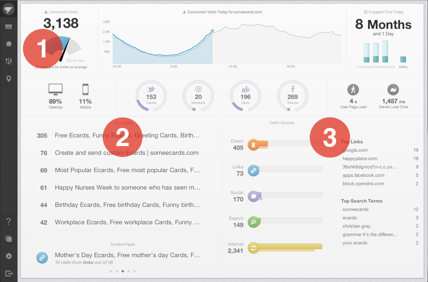
It turned out it wasn’t just the surging pages they wanted to see… they also wanted to know if anything unusual was happening with their more always-trafficked content. So we brought back Top Pages and showed them with the Notable ones as context.
Now the dashboard doesn’t just show you when something special is happening – it also lets you know when you’re doing alright and everything’s just fine.
But that only solved things on the individual page level when the information about the people sending it was every bit as important.
So we changed the visualization of Traffic Sources to show two new things: the top referring domains and search terms and how your performance today compares with your average performance.
Now, no matter if your day is normal, great, or terrible, you can tell right away. And that was the point all along.
So welcome to our new Overview page. We think it answers the three questions that were most important…
- How many people are on my site?
- What are they looking at?
- Where are they coming from?
…but maybe you don’t. That’s awesome. We want to know. This process won’t stop until we do…