Now in Beta: Heads Up Display Link Performance
We’ve been hearing lots of positive things about one of our newest Chartbeat Publishing features, Heads Up Display, which lays data you need over your own webpage and article content. Heads Up Display shares info like the concurrent visitors on the page, top articles on the page through simple rank pins, clicks per minute on each article, and a whole bunch of other stuff.  And while it’s amazing to know that your top positioned article is the #1 article on the page – there was one question we (and lots of you) wanted to know: Is that article performing as well as other articles have done in that same position in the past, or is it just doing well because it’s in the top spot?
So we’re testing exactly this question with a new feature in beta right now that we’re calling Link Performance– all to get your feedback, thoughts, high fives, and no ways. With this guy now incorporated in your Heads Up Display, you can answer questions like:
- Is an article getting a ton of clicks because it’s new or in a prime position or because the content is actually compelling?
- Where are the hidden gems on my page? Which articles are actually doing well for their position, but are maybe getting lost in the clutter?
- Which headlines look like they need some love?
- Which articles need to be removed?
- Has my article reached its peak and need to be swapped out?
Here’s how it works: Link Performance measures certain effects like where the link is on your page and how long the link has been in that particular position. This measurement also takes into account the real-time speed (what we call click rate) that readers are clicking on a link to an article as a percentage the overall pool of people who could actually click now. We’ve built models for every position on your homepage – yours specifically, not some general homepage template – and these models take into account the amount of time each article has been in its current location. By knowing how long an article has been in that spot, we can tell how it’s done performance-wise since you posted it – has it reached its peak yet or still gaining speed? That way you know when to swap it out. We’ve added a visual tracker that shows just this – how long a link has been in this position and how it’s performing against other links that have been in that same position. The Heads Up Display uses these models to determine how each article is performing relative to those three factors: article position, how long the article has been in that position, and the number of potential readers. Simple, color-coded signals show you how an article is doing in real-time:
Overperforming/Green = Good, the article is doing better than average

Performing on average or baseline/Yellow = Potentially good or time to swap it out. Depends on the content and your call, as the decision maker, if it should be changed up.
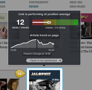
Underperforming/Red = Not so great. Time to get another story in here that’ll do better in this position than this current story.
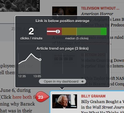
If you’re seeing gray pins, that could be for a number of different reasons, most likely because it’s a brand new story/placement and we just need another minute to gather and share the data.
Based on all this info, we hope you’re better armed to take action to shift things around, rewrite some headlines, layer on more content, whatever a particular piece needs to get a through-the-roof performance out of that link in that position (or another).
Again, this is something we’re testing to see how you’re using it (or not), what you like (or don’t), and what thoughts (or questions) you have as you play around with it. With your feedback, I, along with my fellow Chartbeat data scientists and our Product and Engineering teams, can iterate and build on this feature to make sure it’s as useful as possible. So let us know what you think.
Note: The three above images are displaying mock data (we don’t share your data without your permission)